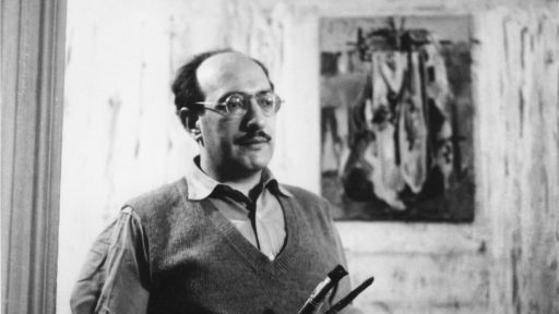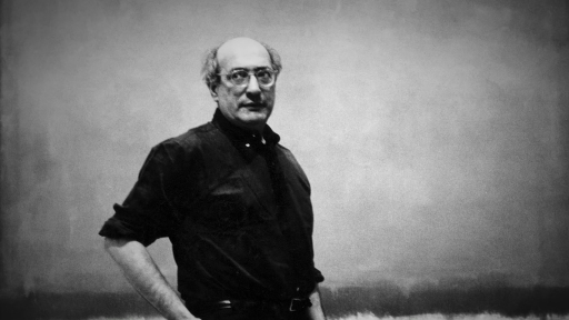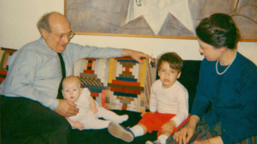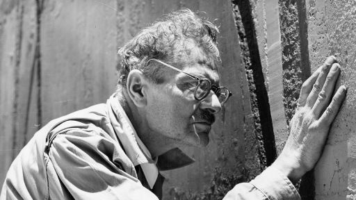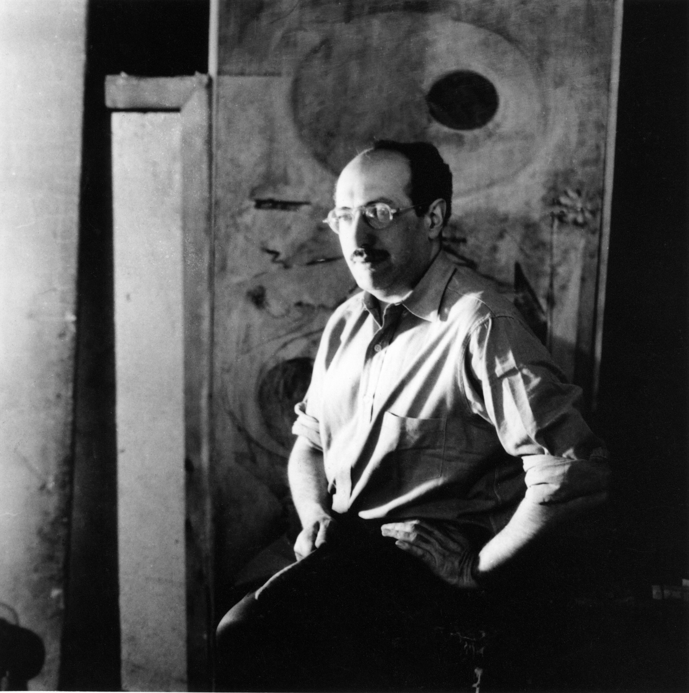
Mark Rothko seated in front of painting Photograph courtesy of Kate Rothko Prizel and Christopher Rothko.
MARK ROTHKO
A central figure among the abstract expressionists who emerged in New York in the late 1940s, Mark Rothko brought a new sense of drama into abstract art. In his large floating rectangles of color, which seem to engulf the spectator, he explored the expressive potential of color contrasts and modulations with a rare mastery of nuance. Yet in spite of the extreme formal refinements of his paintings, Rothko refused to consider them in terms of design and color. “There is no such thing as good painting about nothing,” he claimed. “The subject is crucial and only that subject matter is valid which is tragic and timeless.”
STREET SCENES AND INTERIORS
Mark Rothko was born Marcus Rothkowitz in Dvinsk, Russia (today Daugavpils, Latvia), in 1903. At the age of ten he immigrated with his family to the United States, where they settled in Portland, Oregon. Having been awarded a scholarship, Rothko went to Yale University in 1921, but he dropped out two years later and moved to New York. He began to attend classes sporadically at the Art Students League, where his teacher, Max Weber, encouraged him to work in an expressionist manner. The modernist painter Milton Avery, who met and befriended Rothko in 1928, also made a profound impression on the younger artist through his simplified and colorful depictions of domestic subjects.
In the 1930s, while earning his living by teaching art classes for children, Rothko painted mostly street scenes and interiors with figures. Rejecting conventional modes of representation, he stressed an emotional approach to the subject—an approach he admired in children’s art—and he adopted a style characterized by deliberate deformations and a crude application of paint. An air of discomfort and tension pervades Rothko’s art from this period, even after his compositions become more structured in the second half of the decade. Spaces are often claustrophobic and figures are distorted, cramped in the corner of a room or awkwardly framed by a window. In his subway scenes the isolated and attenuated figures of passengers merge with the iron pillars of the platform on which they appear to be trapped. Street Scene of c.1937 shows three figures dwarfed by an imposing architectural element that blocks off two-thirds of the canvas. The bold division of the surface and the tension it creates between depth and flatness produce a dramatic effect and prefigure the mood and format of Rothko’s later abstract works.
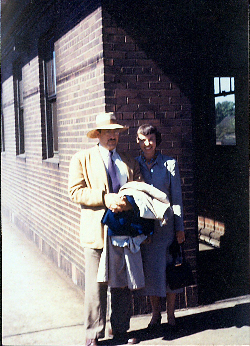
Mark and Mell Rothko standing at the East Cleveland Ohio train station, summer 1949. Photograph courtesy of Kate Rothko Prizel and Christopher Rothko.
MYTHS AND SYMBOLS
In the social climate of anxiety that dominated the late 1930s and the years of World War II, images from everyday life—however unnaturalistic—began to appear somewhat outmoded. If art were to express the tragedy of the human condition, Rothko felt, new subjects and a new idiom had to be found: “It was with the utmost reluctance that I found the figure could not serve my purposes….But a time came when none of us could use the figure without mutilating it.” Together with artists such as Jackson Pollock and Adolph Gottlieb, Rothko turned for inspiration to the myths of antiquity, especially those featured in Greek tragedy. For Rothko these myths were “the eternal symbols upon which we must fall back to express basic psychological ideas. They are the symbols of man’s primitive fears and motivations.” In his paintings of the early 1940s he combined modernist dislocations with friezes of heads and architectural motifs harking back to ancient relief sculpture from Egypt, Mesopotamia, and Greece. The hybrid figure of Untitled, 1941–1942, thus appears as a modern version of the half-human/half-beast creatures from mythology.
Rothko’s interest in myths and symbols was stimulated by the example of the surrealists, several of whom had recently immigrated to New York from war-torn Europe. Inspired by the surrealist technique of automatism—which consists in letting the brush meander without conscious control in an attempt to release the creative forces of the unconscious—Rothko loosened up his technique and developed a more abstract imagery. In remarkably free watercolors of the mid-1940s, related to the art of the surrealists Joan Miró, André Masson, and Arshile Gorky, Rothko explored the fluidity of the medium to evoke a vision of primeval life. Biomorphic forms dance before a background of horizontal bands that resemble geological strata or the layers of a submarine universe. Through their luminosity and transparency Rothko’s watercolors of this period marked a turning point in his career. The artist soon achieved similar effects in his oil paintings by diluting his pigments and applying his paint in very thin, overlapping glazes.
TOWARD ABSTRACTION
Between 1947 and 1950 all figurative associations and references to the natural world disappeared from Rothko’s paintings. Linear elements were progressively eliminated as asymmetrically arranged patches of color became the basis of his compositions. In these so-called multiforms the liquid paint soaks the canvas, leaving soft, indistinct edges, while whitish outlines surround some of the shapes like haloes. Rothko now relied on these shapes, which replaced the earlier biomorphic motifs, to convey emotional states. For him, eschewing representation permitted greater clarity: “the elimination of all obstacles between the painter and the idea and between the idea and the observer.”
By 1950 Rothko had reduced the number of floating rectangles to two, three, or four and aligned them vertically against a colored ground, arriving at his signature style. From then on he would work almost invariably within this format, suggesting in numerous variations of color and tone an astonishing range of atmospheres and moods. Rothko also now resisted explaining the meaning of his work. “Silence is so accurate,” he said, fearing that words would only “paralyze” the viewer’s mind and imagination. For the same reason Rothko largely abandoned conventional titles in 1947, sometimes resorting to numbers or colors in order to distinguish one work from another.
TRAGEDY, ECSTASY, DOOM
You might as well get one thing straight….I am not an abstractionist.
…I’m not interested in relationships of color or form or anything else.
…I’m interested only in expressing basic human emotions—tragedy, ecstasy, doom, and so on.
MARK ROTHKO, 1957
Throughout his life Rothko considered painting to be a philosophical enterprise. Visual sensations were not an end in themselves but only a means of communicating spiritual truths. A fervent of the nineteenth-century German philosophy Friedrich Nietzsche, Rothko embraced the Nietzschean vision of tragedy—and art in general—as a fusion of rational order and irrational impulses. In Rothko’s paintings, this translates into carefully calculated measures and proportions combined with the belief that expanses of color have a mysterious, mesmerizing power to move the viewer. In his unprecedented harmonies Rothko altered the traditional psychological values assigned to color. For him a painting like No. 5, in which a red band interrupts fields of yellow and orange, was not as optimistic as people were inclined to perceive it; “it is tragedy instead,” he said.
Fascinated—as was Nietzsche—by the capacity of music to arouse emotions, Rothko aspired “to raise painting to the level of the poignancy of music and poetry.” To this end he resorted to an impressive panoply of visual effects. Each canvas is composed of several thin layers of paint applied in various degrees of saturation and transparency. By letting the background show through intermittently, this meticulous application turns the top layers into luminous, translucent veils. The feathery brush strokes that blur the edges, in contrast with the bold, sweeping strokes that modulate the large surfaces, transform the rectangles into soft hovering forms. There is no traditional effect of perspective, but a suggestion of shallow space brings the colors forward as if to envelop the viewer—an impression reinforced by the absence of a frame and the large size of the canvas. “I paint large pictures,” Rothko explained, “because I want to create a state of intimacy.”
Although Rothko repudiated any single interpretation of his paintings, his large fields of color have often been associated with landscape painting, especially with the vast, awe-inspiring open spaces of nineteenth-century romantic landscape. If one focuses, however, on the structure of Rothko’s works, their rectangular forms and insistent compartmentalization also suggest comparisons with architecture—a view supported by the continuity between Rothko’s early street and subway scenes and the format of his classic paintings. Rothko was the product of an urban culture and, as such, more likely to locate the tragic element of modern life within the architectural spaces of the city.
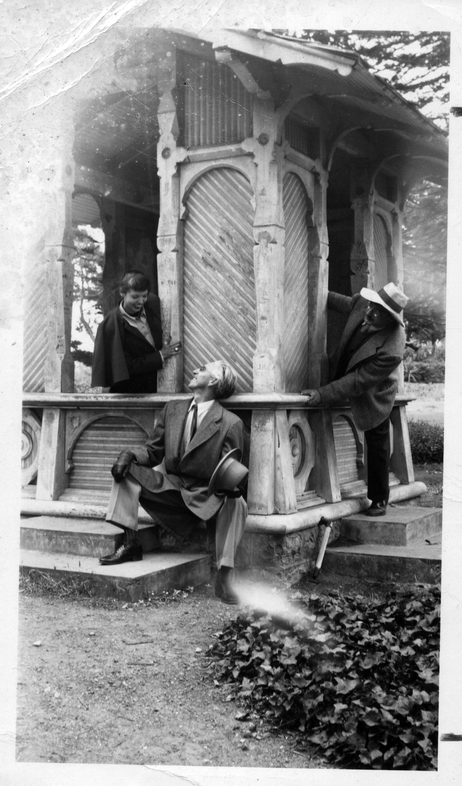
Mark Rothko Mell Rothko and Clyfford Still in San Francisco. Photograph courtesy of Kate Rothko Prizel and Christopher Rothko.
ENVIRONMENT AND DARKNESS
In 1958 Rothko was invited to create a series of mural paintings for the Four Seasons restaurant in the Seagram Building in New York. Although he eventually withdrew from the commission, realizing that a dining room was not an appropriate setting for his art, he produced several sets of paintings for this project in which he experimented with a new format and darker palette. Red or brown open rectangles advance or recede on a maroon background, articulating the canvas the way pilasters and moldings define the surfaces of Renaissance architecture, a source acknowledged by the artist.
Rothko’s palette also changed in his easel paintings after 1957. He abandoned the luscious reds, yellows, and oranges that he had favored since 1950 and turned to somber tones of brown, dark reds, olive greens, blues, and blacks. White or red forms occasionally break through this darkness, as in No. 1 (White and Red), to create a strong effect of light and shade that could be likened to the works of Rembrandt, one of Rothko’s favorite old masters, in which a ray of light illuminates a dark setting.
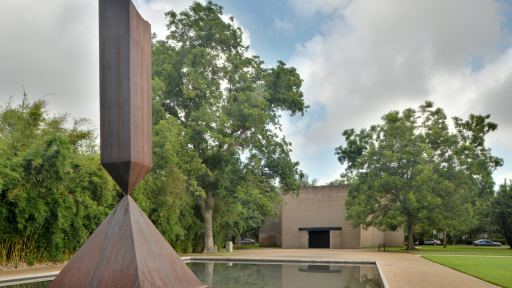
Rothko received his most important mural commission in the mid-1960s, for a chapel at the University of St. Thomas in Houston, Texas (now known as the Rothko Chapel). The austere black, deep crimson, and purple canvases he produced on this occasion are perhaps his most challenging works. Gone are the seductive contrasts of color, now replaced by subtle differences between matte and shiny surfaces. Gone as well as the sensuous, feathery edges; instead, forms are defined by straight borders. The large scale of these panels, their placement within the chapel, and the proportions of the forms, which Rothko determined to the eighth of an inch, increase their solemnity, creating, by the account of most visitors, a compelling atmosphere of spirituality.
THE FINAL YEARS
Following a heart attack in 1968, Rothko gave up the physical effort required of painting large-scale canvases and concentrated on small acrylics on paper. Excited by the possibilities of this quick-drying medium, he produced a group of paintings that depart from his previous work by their vibrant, expressive brushwork and wide range of color. In some of them Rothko used a new, muted palette of pale grays, blues, and mauves, in which highlights of white make the surface flicker.
Rothko’s last great achievement is a series of brown or black and gray paintings of 1969–1970 in which he once again created variations on a single compositional structure. This time, however, he altered the format significantly, dividing the canvas into two fields surrounded by a clean white border (adapted from the use of masking tape to attach sheets of paper to the easel). This series epitomizes, in an ascetic mode, some of the contrasts Rothko had explored earlier—in a more colorful context—between light and dark, and between calm and agitated surfaces. The serenity of the dark zone, painted more evenly, stands out against the turbulent brushwork of the lower section of gray modulated by shades of ocher or blue. The sharply defined margin is a striking new feature in Rothko’s art. It establishes a more complex interplay between the work and the viewer, the latter being at once drawn into the painting by its sensuous treatment, and kept at distance by the stark framing device.
Suffering from illness and depression, Rothko committed suicide on February 25, 1970. By the time of his death, art in America had changed drastically. The formal exuberance and metaphysical anguish of the abstract expressionists had given way to the cool, impersonal approach of the pop and minimalist painters. Rothko’s role in the development of abstract art in our century was essential. In his vibrant, disembodied veils of colors he asserted with a new immediacy the power of abstraction to convey strong emotional or spiritual content.
About the author
Isabelle Dervaux, Acquavella Curator of Modern and Contemporary Drawings, The Morgan Library & Museum, and formerly associate curator, department of exhibition programs, National Gallery of Art, Washington.
Originally published as a brochure by the National Gallery of Art, Washington, for the exhibition Mark Rothko (1998). The Gallery maintains the largest public collection of art by Mark Rothko and will be publishing a digital catalogue raisonné of the artist’s works on paper. See the catalogue in progress at rothko.nga.gov.